A Pika CSS tweak for headings
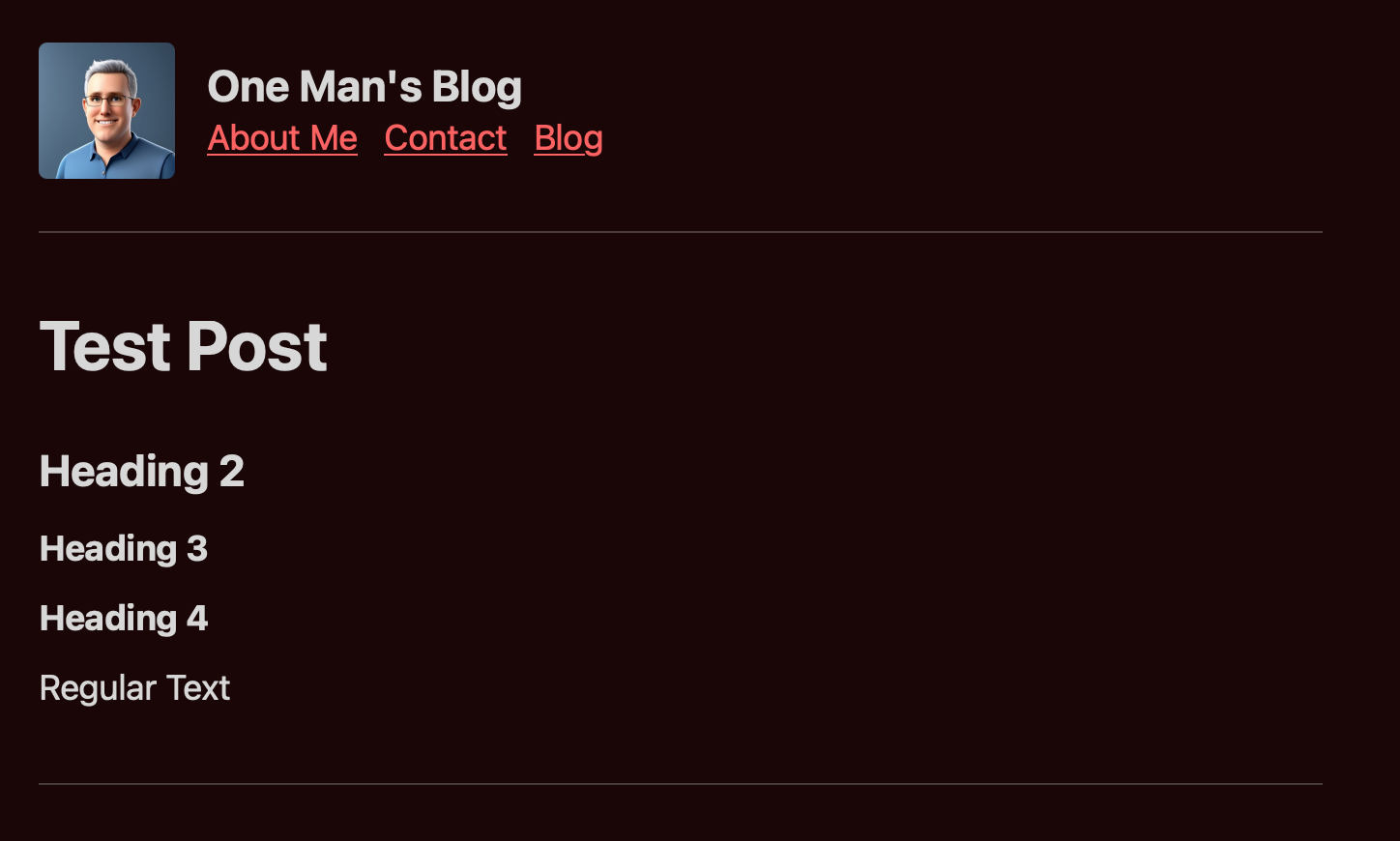
The default CSS in the Pika theme reminds me of the notes app Agenda: it’s nearly impossible to tell some header types apart. Pika’s default doesn’t provide enough variation in header sizes to set things apart, nor does bold text stand out much from regular text. As a nerd who wants headings to indicate structure of my documents none of this works for me. Fortunately for me Pika allows setting custom CSS.
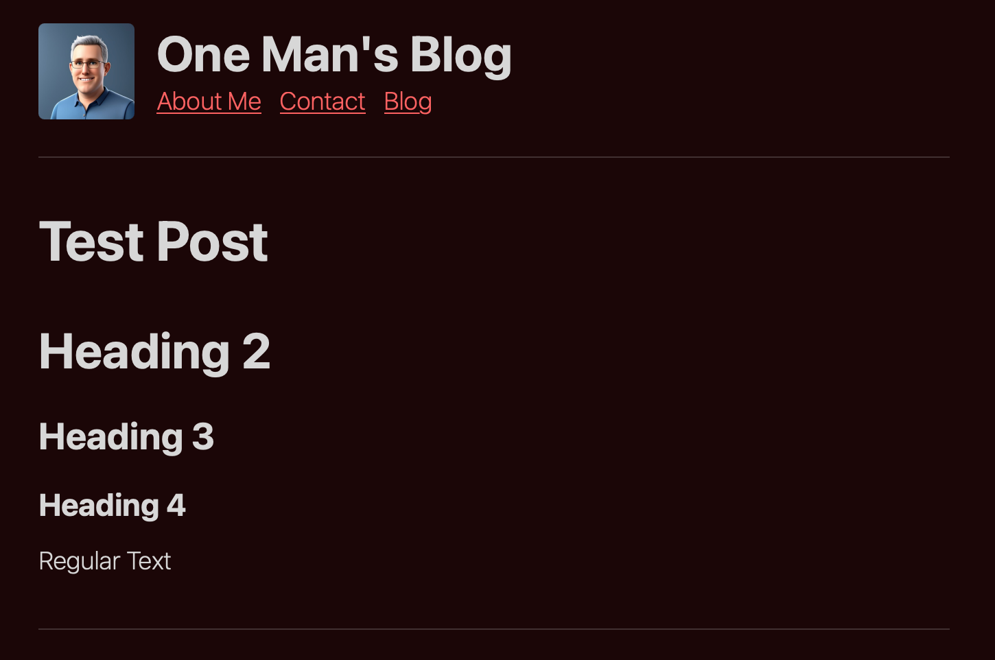
Keeping in mind I am not a CSS expert here, is my custom CSS to update the headings to stand out more from one another. I also lowered the weight of the standard body text because the default is weigh (see what I did there?) too much.
Here is what the default looks like:

Here is what it looks like with my tweaks:

:root {
    --font-3XL: 2.25em;
}

*,*:before,*:after{
    box-sizing: border-box;
    font-family: inherit;
    font-size: var(--font-M);
    overflow-wrap: break-word;
    vertical-align: baseline;
}

.site-view {
    font-weight: 200;
!important;
}

h1 {
    font-size: var(--font-3XL);
    line-height:calc(var(--base-line-height) * 0.8);
!important;
}


h2 {
    font-size: var(--font-2XL);
    line-height:calc(var(--base-line-height) * 0.9);
!important;
}

h3 {
    font-size: var(--font-XL);
    line-height:inherit;
!important;
}

h4 {
    font-size: var(--font-L);
    line-height:inherit;
!important;
}